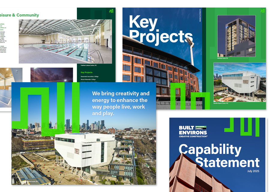
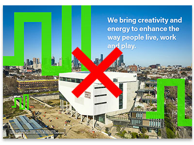
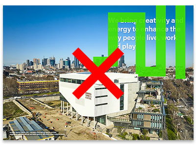
The cityscape graphic shows a simplified macro view of a city adding vibrancy and energy to our communications and is an integral part of the Built Environs brand look & feel.
The cityscape graphic may be used at different zooms, configurations and crops depending on where it is being used.
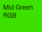
The cityscape is depcited in our ‘mid-green’ colour only.
It’s important that this colour is reproduced accurately. The mid-green colour is specifcally designed to be vibrant and eye-catching when viewed digitally, on-screen in RGB.
When printed ensure PMS (sometimes referred to as Pantone) colour is used, to try and capture that vibrancy.
RGB Makes colours for screen from Red Green and Blue.
CMYK Makes colours for print from a mix of Cyan Magenta Yellow and Black inks.
Pantone PMS Matches the exact colour specified from one single printing ink. Also used to reference paint colours and vinyl for signs.
When to use which value
RGB Use RGB values when displaying colours on screen for websites, PowerPoint and other on screen or digital environments.
CMYK Use CMYK values for four colour process, offset, short-run, digital or laser printing. Note CMYK cityscapes do not offer the best match with RGB.
PMS Use PMS (spot) values for offset printing or signage.
Use the correct coloured cityscape for the intended output
RGB: 62/224/0
HEX: #3EE000
CMYK: 66/0/100/0
PMS: Pantone 802 C
Flexible
We’re flexible in how we size the cityscape depending on where it is being used.
This means the cityscape can be sized appropriately to reflect the tone of the message and context of the application. Whether large and bleeding off the page, sitting over an image, cropped in tight or small on the edge of the page, the cityscape graphic can adapt to support the message.
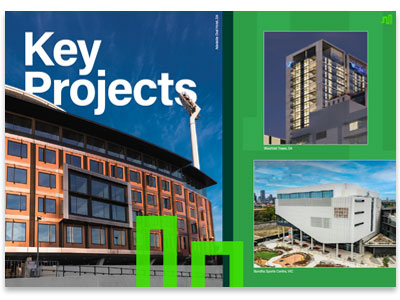
Transparency
When sitting over images the cityscape graphic is set with a transparency overlay of 80%.
Ensuring the image below is visible through the cityscape itself.
Usage
For greater impact the cityscape should be most visible on covers and section dividers.
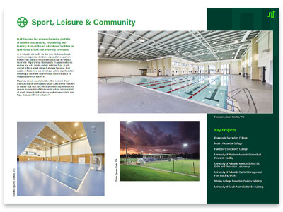
On internal content the cityscape should be less prominent. Acting as an ident in a corner of the page/slide.
Don’t use the cityscape more than twice on a page/slide.
Don’t cover headings or body text with the ctyscape.