Colour
Colour Palette
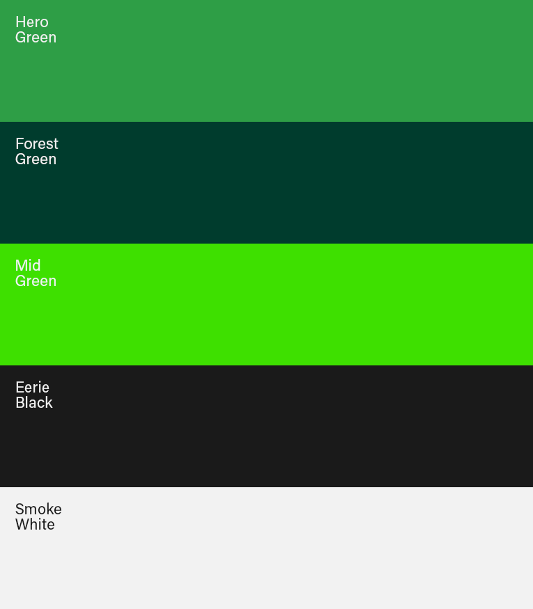
Green white and black, these are our brand colours that form a strong visual association with the McConnell Dowell brand.
Consistent use of colour is vital in building a strong and easily recognisable Built Environs brand.
Hero Green
Our hero colour is at the heart of our visual identity. It’s our signature colour that identifies Built Environs. Hero green is the same colour as the green of McConnell Dowell. It’s in our logo and where appropriate may be used in large blocks as a background colour.
White
White is used in our logo and in large blocks as a background colour. Type set as white when reverse on an image or coloured background.
Black
Black is used on our ‘Blackout’ type style and for setting other typography. We use a rich shade of black which is darker than standard. Black makes our greens look brighter. Don’t use black in large blocks or as a background colour.
Vibrant Green
A spirited colour used in our cityscape pattern. It can be used for graphs, infographics and as header text. Don’t use mid green in a large block or as a background colour.
Colour Reproduction
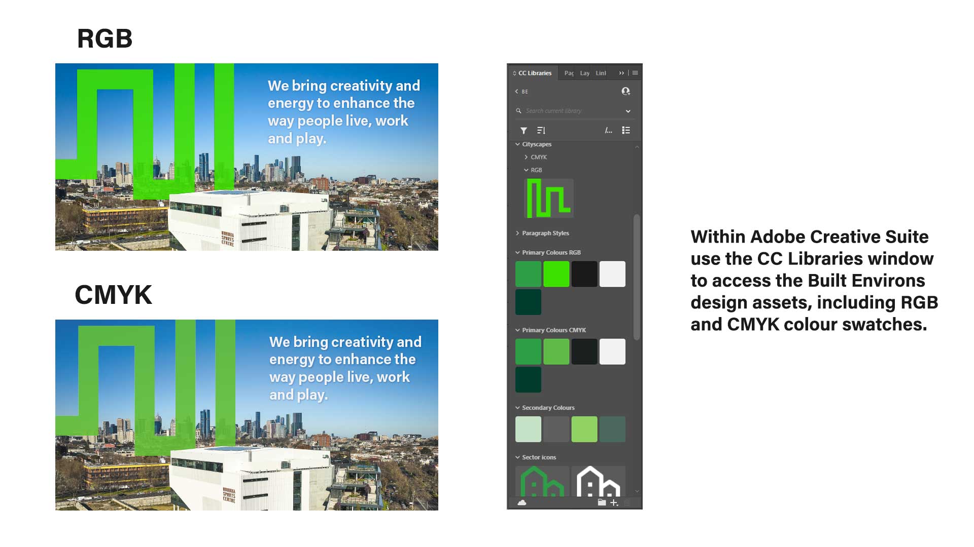
It’s important that our brand colours are reproduced accurately. Colours change dramatically between screen and print. This is particularly noticeable in the Vibranrt Green cityscape.
Always use the specified PMS, CMYK and RGB values for each colour.
Each value has been specifically calibrated for that particular display environment. These values enable accurate reproduction of all colours in print and digital scenarios.

RGB
Makes colours for screen from Red Green and Blue.

CMYK
Makes colours for print from a mix of Cyan Magenta Yellow and Black inks.

Pantone PMS
Matches the exact colour specified from one single printing ink. Also used to reference paint colours and vinyl for signs.
When to use which value
RGB
Use RGB values when displaying colours on screen for websites, PowerPoint and other on screen or digital environments.
CMYK
Use CMYK values for four colour process, offset, short-run, digital or laser printing.
PMS
Use PMS (spot) values for offset printing or signage.

RGB: 46/158/70
HEX: #2e9e46
CMYK: 75/0/95/15
PMS: Pantone 7740

RGB: 0/60/45
HEX: #003c2d
CMYK: 89/48/78/57
PMS: Pantone 5535 C
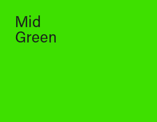
RGB: 62/224/0
HEX: #3ee000
CMYK: 66/0/100/0
PMS: Pantone 802 C

RGB: 26/26/26
HEX: #1A1A1A
CMYK: 65/75/75/65
PMS: Pantone Black 6 C

RGB: 242/242/242
HEX: #F2F2F2
CMYK: 0/0/0/5
PMS: Pantone 663 C
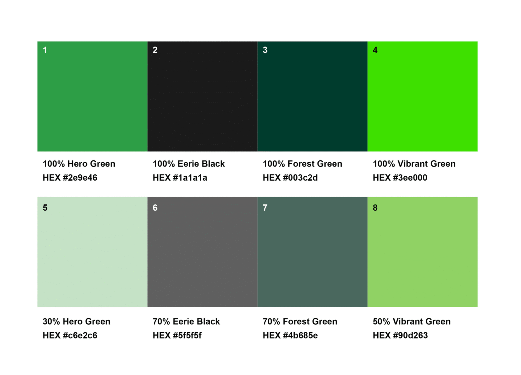
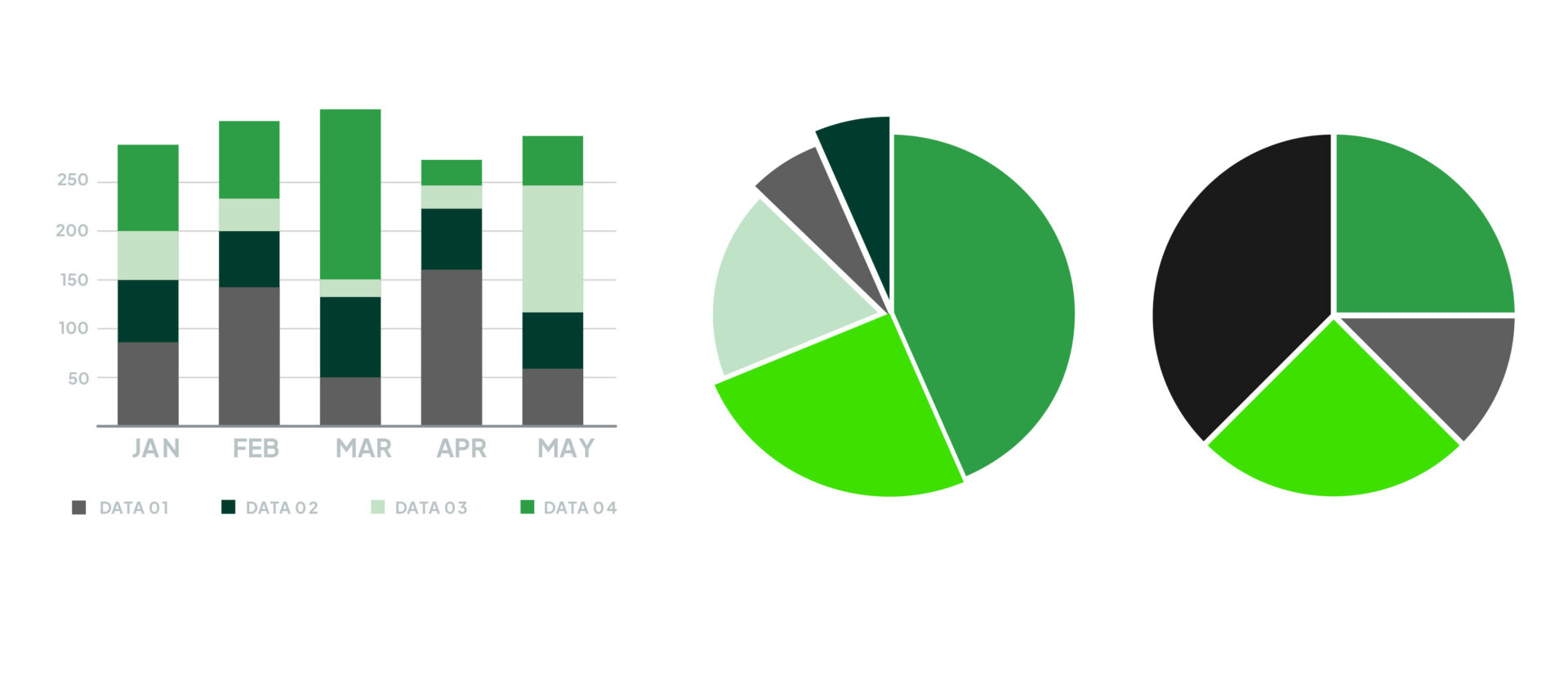
Colours for Information Graphics
Use our brand colours and tints from our brand colours for colouring information graphics.
The examples here demonstrate:
- Permitted colours and tints
- The sequence of our brand colour tints
- Relative importance of colours in sequence
Additional tints can be added if required.
Adjust Colours for Output
Colours change dramatically between screen and print outcomes. This is particularly noticeable with Vibrant Green and Cityscape graphics.
To ensure correct colours it’s important to always:
- Use the right colour swatches for the intended output
- Update logo links
- Update cityscape links
