Logo
Our Logo is our brand’s signature and is a key visual representation of the brand. The logo combined with the strapline: Creative Construction, helps us stand out, creating a distinctive, recognisable and ultimately memorable Built Environs brand identity.
Used effectively with all other components of the brand identity, the logo plays a vital role in the overall visual identity system.
Our logo has been specifically crafted. Only use the master artwork files, never separate, modify or re-draw our logo.
Colour logo downloads
Use the reversed logo, on our hero green background, wherever possible.
Reversed logo (primary):
Logo downloads above are;
Office use:PNG format for internal document sand screen/online work.
Print use: PDF format for professional printing – banners, posters etc.
Full BE logo suite downloadable at top & bottom of this page.
Positive logo (secondary):
Mono (1-colour) logos
Only used when Colour Logo cannot be used.
Reversed logo (primary):
Positive logo (secondary):
Co-branding
Use in layouts where we want the Built Environs logo linked together in a close relationship with the McConnell Dowell logo.

Co-brand horizontal positive

Co-brand horizontal reverse
Co-brand vertical reverse
Co-brand vertical positive
Clear Space & Minimum Size
The Built Environs logo must always be clearly identified on all material and protected by clearspace.
Keep the logo free of other elements
Clearspace is the minimum amount of area around the logo which must be kept free of type, complex photographic elements and other graphics.
Measuring Clearspace
The clearspace area is defined by the width of the capital B in the Built Environs logo.
Minimum size
Minimum size is the smallest recommended sizes for the Built Environs logo be before it starts to become difficult to recognise.
Minimum size in print Print=30 mm wide
Minimum size on screen: 200 px wide
X = width of the capital B
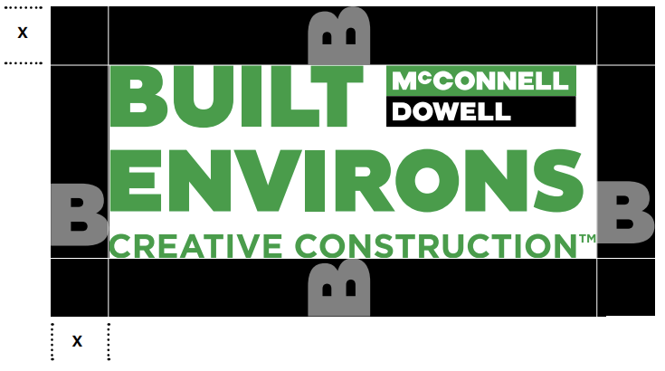
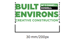
Minimum print size
Incorrect Use
The Built Environs logo should only be used as described in these guidelines. The logo is supplied as digital master artwork files and should never be distorted, redrawn broken apart or altered in any way.
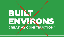
Never break apart the elements
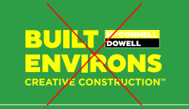
Never change the colour.
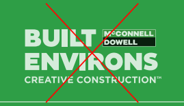
Never make transparent or tinted.
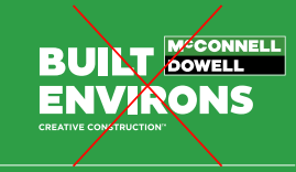
Never change the size or proportions of the elements.
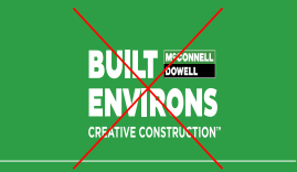
Never distort or skew.
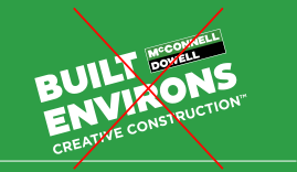
Never rotate or use on an angle.
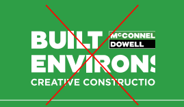
Never crop the logo. It must always be used in its entirety.
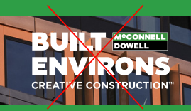
Never use over busy backgrounds.
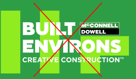
Always ensure there are no graphic elements or complex backgrounds inside the logo clearspace area.
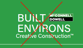
Never change or recreate any elements of the logo.
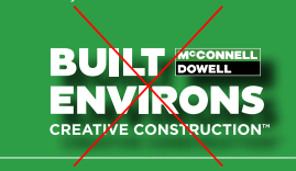
Never apply any effects or filters.
Joint Venture Branding
Branding for Joint Ventures is more complex than single company ventures.
Go to the Joint Venture branding guidelines page here (TBC).

Joint Venture branding example – Horizontal
Home Without Harm
Home Without Harm is the McConnell Dowell and Built Environs official safety sub-brand. It has been designed to be used in conjunction with the Built Environs logo on project sites and PPE.

Master Logo – Positive / 3 lines
Use on a white or light coloured backgrounds only.

Alternative Logo – Positive / 2 lines
Use when space is restricted on a white or light coloured backgrounds only.

Master Logo – Reverse / 3 lines
Use reversed out of dark backgrounds or photography.