Typography
Acumin Pro: Our brand typeface
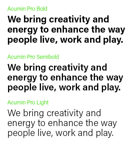
Acumin Pro is the Built Environs typeface and is an important part of the visual language of the brand.
Acumin Pro is the typeface for both headings and body copy.
We use three weights of Acumin Pro:
- Bold for titles and header text
- Semi bold for sub headings and breakout text
- Light for body copy text
Acumin Pro is an Adobe Original typeface that has been chosen for its balanced, rational qualities and its exceptional performance and text size.
Acumin Pro is available via Adobe Fonts and can be activated as part of the Adobe Creative Cloud suite.

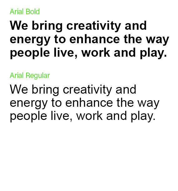
Arial: Our System Typeface
When working internally and Acumin is not available, use Arial.
Use Arial in office applications such as PowerPoint and Word for internal documents, letters, emails, memos, presentations etc.

Typographic Hierarchy
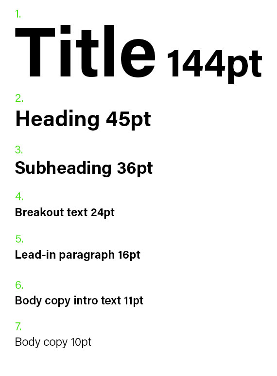
The below measurements provide a framework for setting type within the Built Environs style, and should be used as a guide when executing various layouts.
1. Title
Font= Acumin Pro Bold
Size= 144pt
2. Heading
Font=Acumin Pro Bold
Size=45pt
3. Subheading
Font= Acumin Pro Bold
Size= 36pt
4. Breakout text
Font= Acumin Pro Bold
Size= 24pt
5. Lead-in paragraph
Font=Acumin Bold
Size= 16pt
6. Body copy intro
Font= Acumin semibold
Size= 11pt
7. Body copy
Font= Acumin Light
Size= 10pt

Typographic example layout
The below depicts several of the typographic settings working together on a double-page layout in a capability statment brochure:
